Holachef - Home made food delivered
from curated chefs
About the project
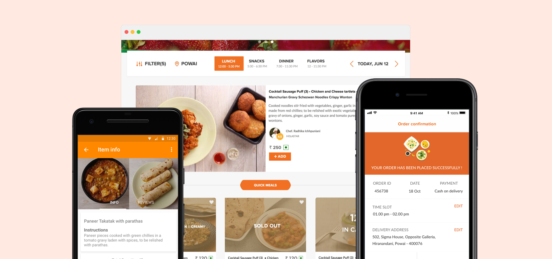
Holachef is a food-tech startup which curates chefs around mumbai and delivers food cooked from them online. Everyday there is a change in menu and compostion of the cuisine. Being a product designer, I was responsible for designing multiple products that catered to the user and ones which also helped the process of the business easier.
Project Type & Involvement
Work in Holachef - Product Design
Timeline
Jun 2015 - Dec 2015
Platforms
iOS, Android & Web
Thinking of digital solutions
As a team, we thought of multiple solutions to make the process and business easier. I was a part of building some of the solutions that were contributing to run the business. I was involved in helping to build the products that helped in digitizing and easing problems that existed in the company by collaborating with the product managers, design manager and researchers to gain a knowledge of the user and with a brand designer to design the product that enhanced the experience for the users.
The product ecosystem
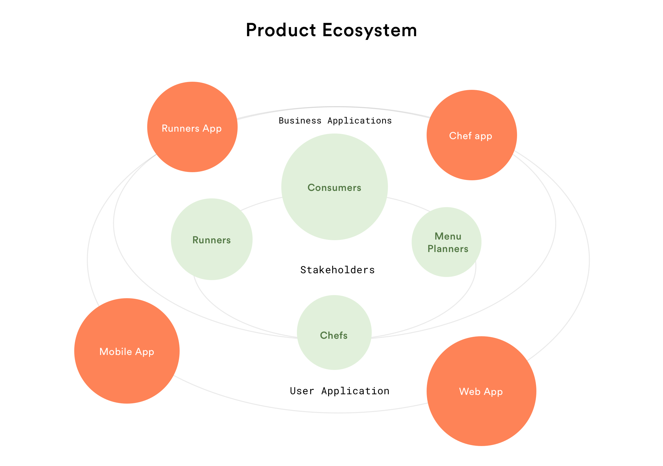
There were multiple needs and multiple stakeholders involved in the functioning of the business. Hence, We designed solutions for multiple stakeholders and their needs. The ecosystem was designed in such a way that the products could integrate with each other and exchange data to provide meaningful solutions. The product ecosystem and the detailed product case studies which I was a part of are as follows.
1)User Applications
Web Application
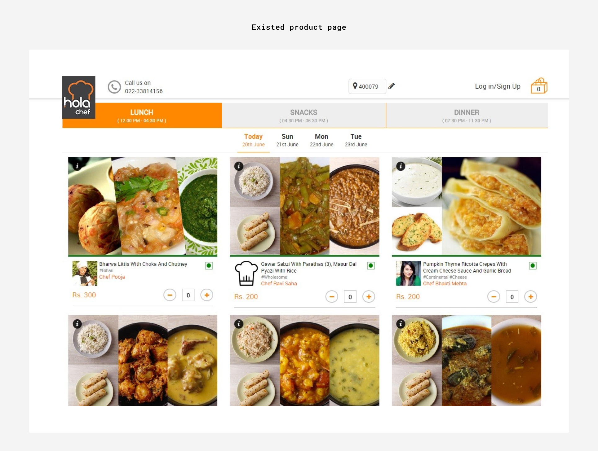
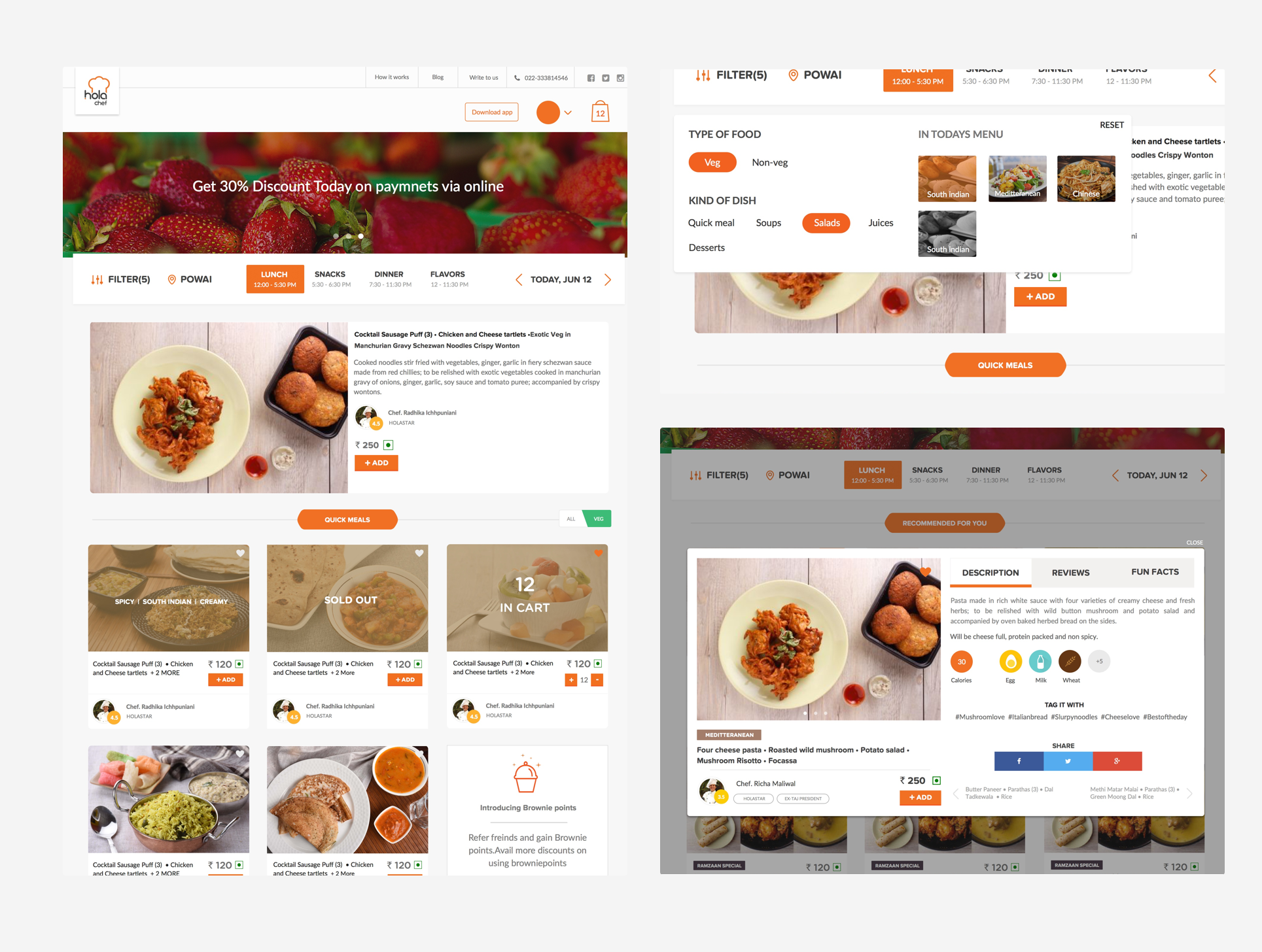
As a part of revamping the primary website & mobile products through which most of the business happens. The goal was to make the website better both in terms of user experience and visual design from the then existed products. We primarily revamped the following elements to make it better.
Initial research & brainstorming
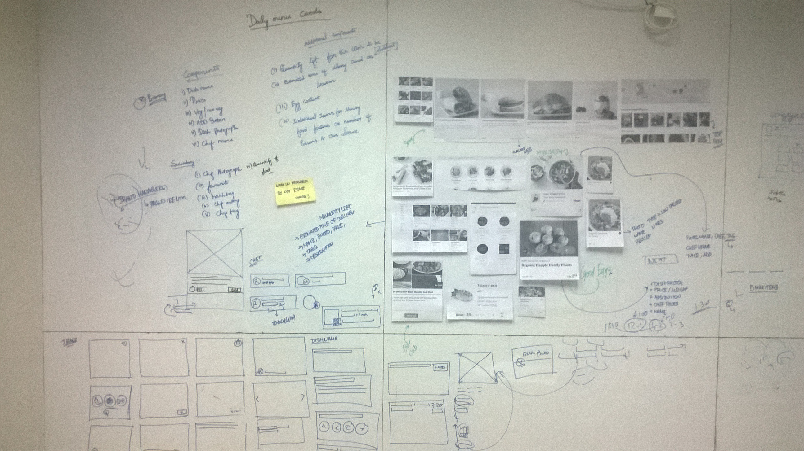
By collaborating with a researcher and by talking to multiple users who were customers if the pre-existed application, the key opportunities were identified. The insights not just gave us an opportunity to improvise the experience but also helped us revamp the entire application for better clarity and to serve the users better.
Identifying the opportunities through insights
2)Lacking detailed information about the food (i.e)Nutrition, Allergens etc.
3) No Filters based on types of food & cuisines.
4) Ability to promote a featured food.
5) Improve visual appeal.
Revamping the product
Mobile Application
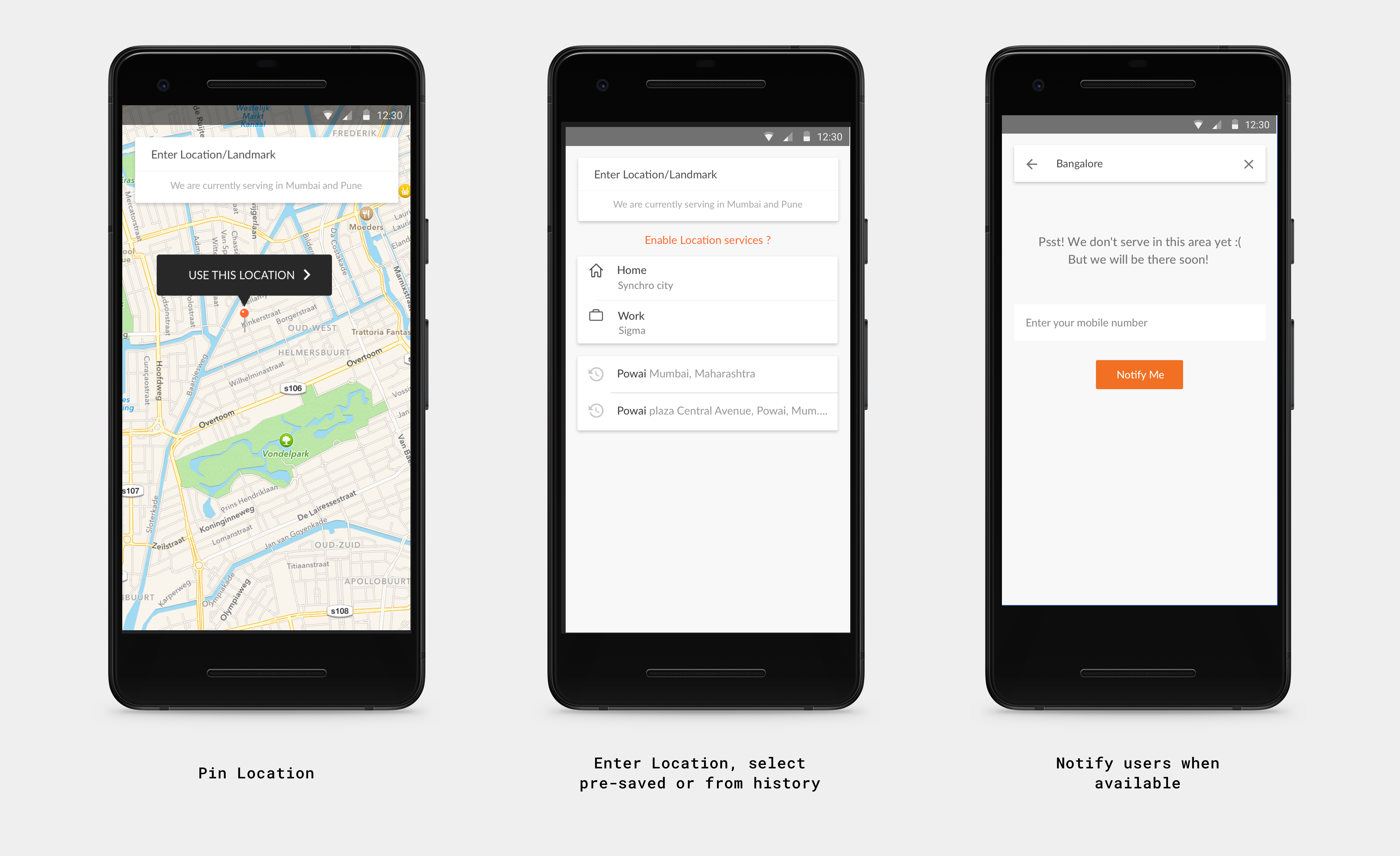
The mobile application allowed users to order a home cooked food chefs quickly to satisfy their craving. Along with working on the web application revamp I was also a part of designing the mobile application which was a major part of the consumer business. I was a part of designing some vital workflows of the application. The colours, fonts, iconography was adapted from the one which was used in crafting the website. Below are some of the workflows I was a part of.
2) Chef App
The Problem
Having an refreshing & new menu everyday, the menu planning team has to communicate with the chefs before they plan the menu for a particular day. This was done through e-mails and phone calls which was tough to be streamlined and get the response and manage the same. In order to ease this process with a digital solution and provide a hassle-free communication, we design an application for the same.
Framing the features from insights
After collaborating with the stakeholders ( Primarily the chefs & menu planners) we identified zeroed in the following points.
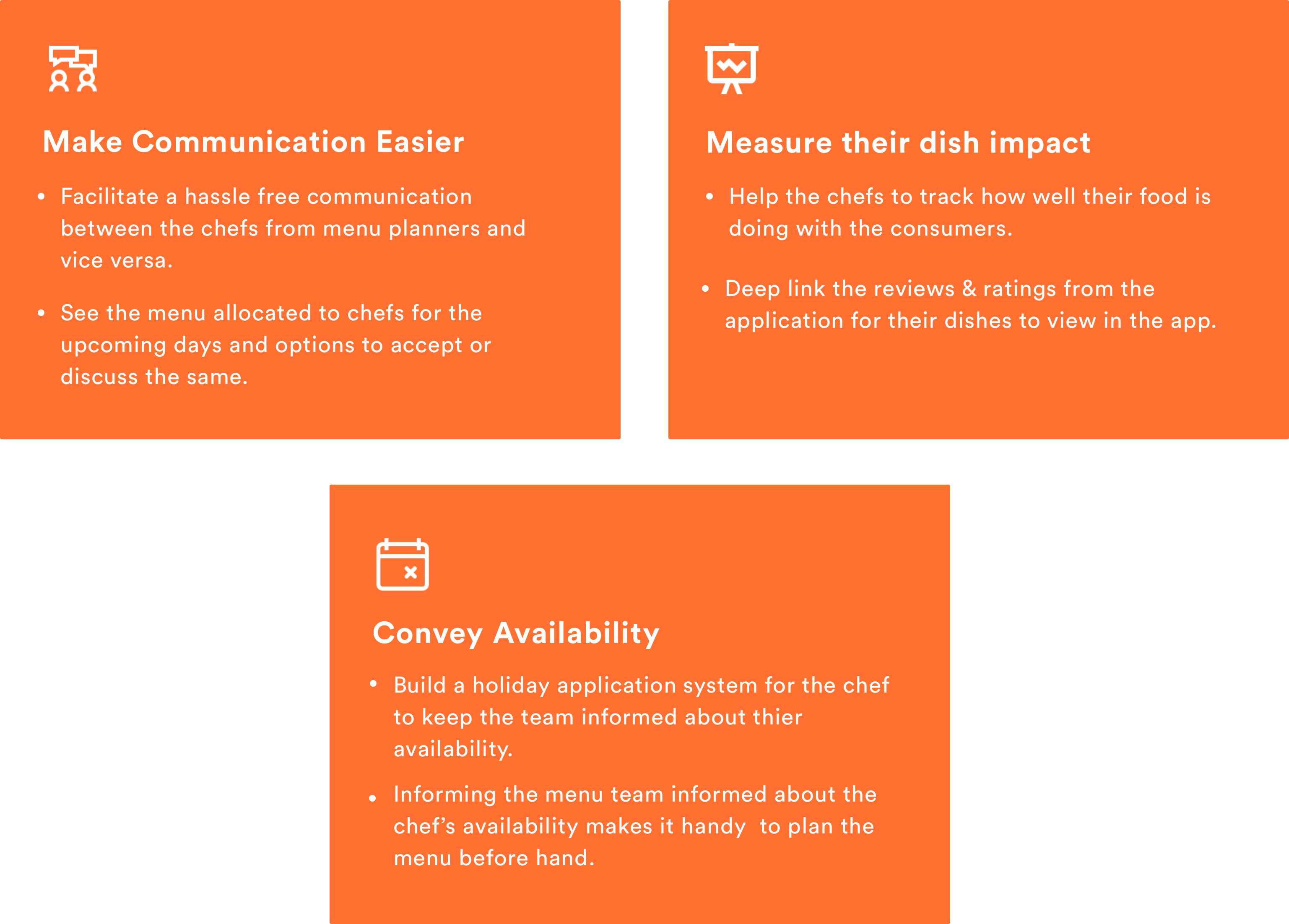
Solution
An android app facilitated the chefs to do the narrowed down tasks discussed above. I was primarily involved in the interaction design & finishing up the product with visual design. The prototypes of the key functionalities are mentioned below.
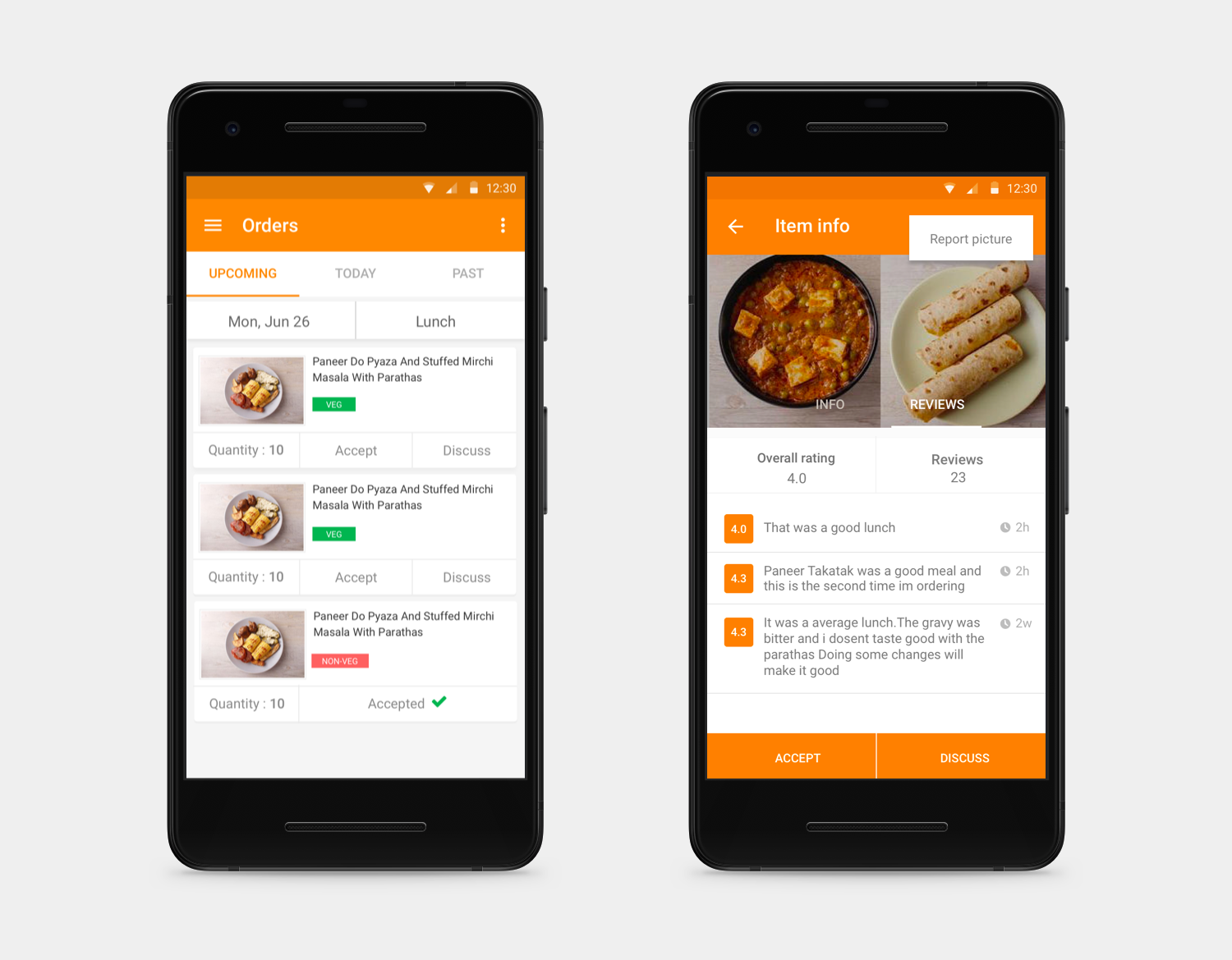
View and accept menu items
The chefs get the menu planned for them in the home screen and they have the option to accept which in turn is recorded as a response for the menu planners. The chefs also have the ability to discuss about the dish in case if they have a concern about the same.The detailed screen shows the number of portions, previous reviews and ratings & an option to report the picture of dish if the chef feels if it is wrong or can be changed which in turn reflects for the user.
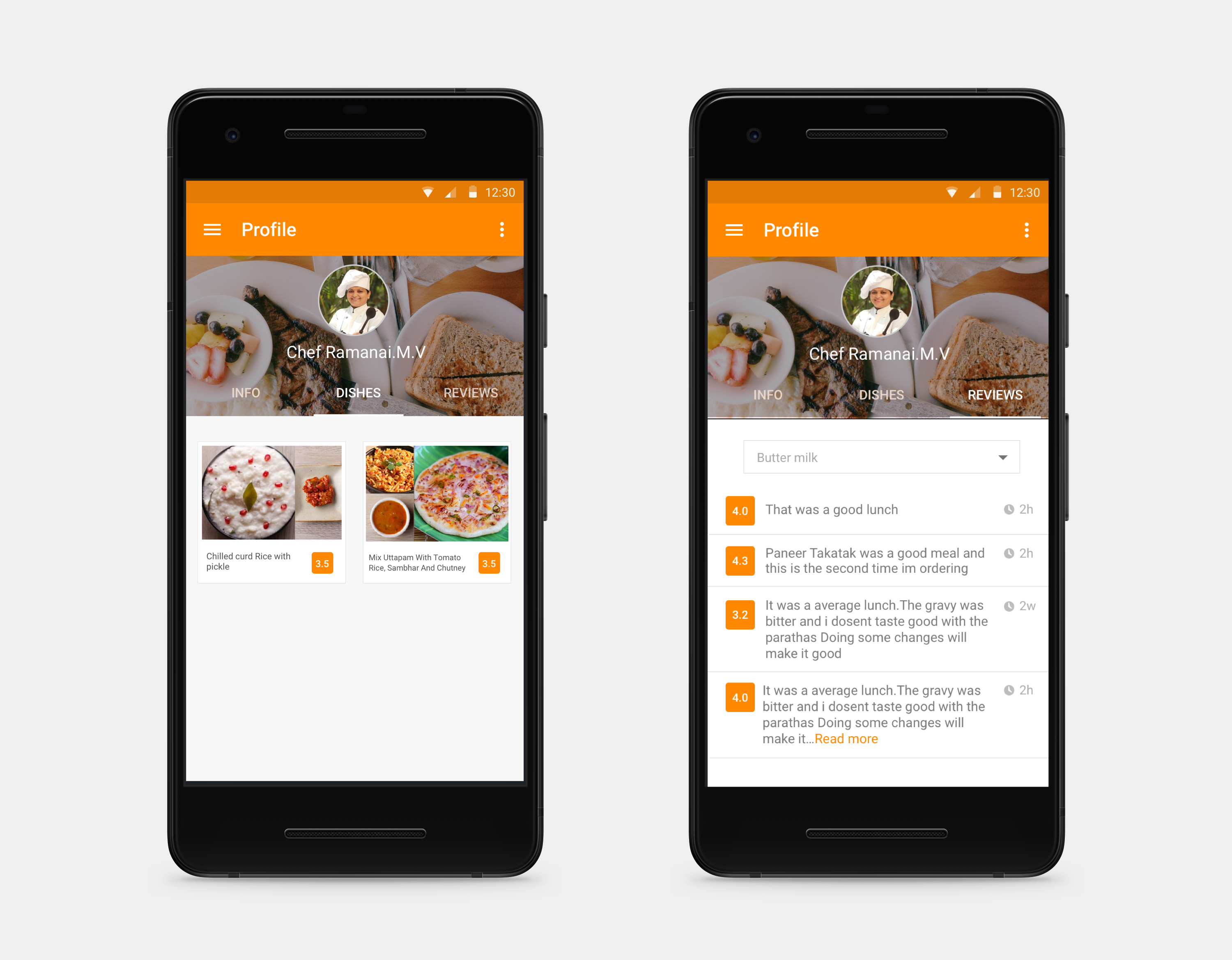
Chef's dishes & impact
The chef's profile page allowed them to view the dishes they are serving or have served and the reviews tab helps them to view the reviews and ratings for a specific dish which helps them improve themselves in their upcoming servings.
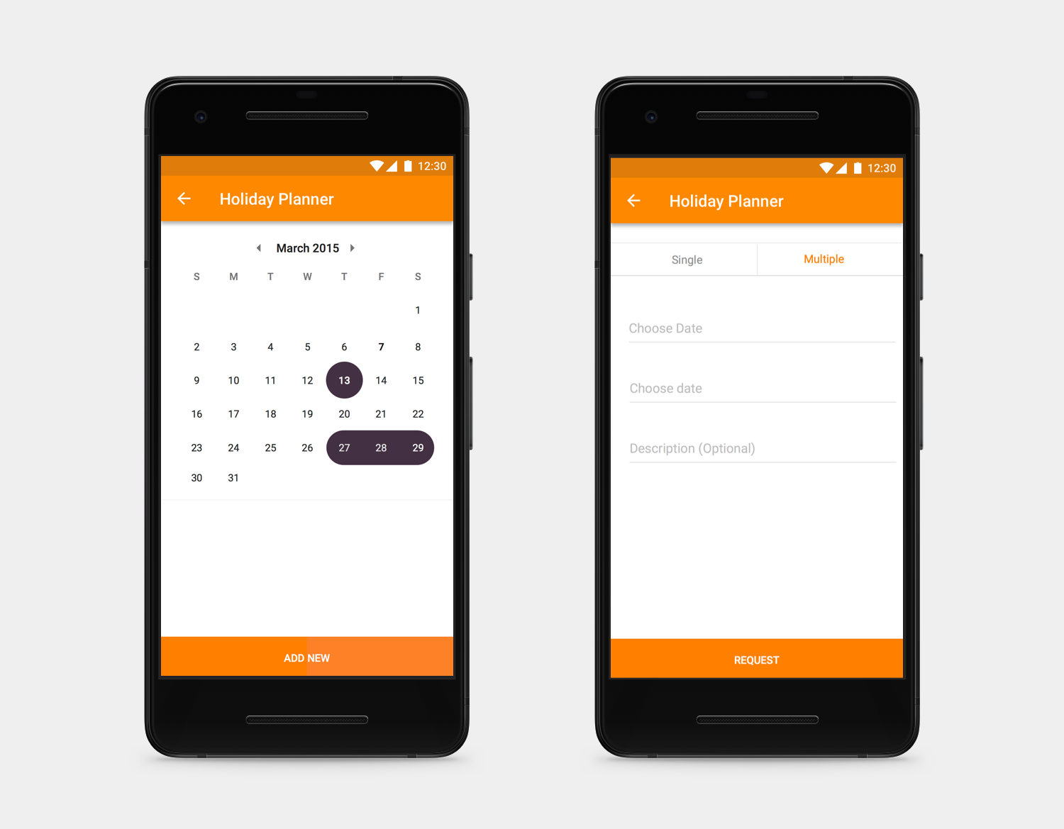
Conveying Availability & holidays
The chefs will be able to convey their holidays beforehand using the simple holiday planner which will be conveyed to the menu planners to plan it comfortably. Also, it would reduce the amount of phone and e-mail requests for the planners to discuss the availability of the chefs.
3)Runners App - An app for delivery executives
The Problem
1)To design an app for the delivery person to effectively deliver orders and do pickups from the chefs and food centres.
2) Allow the delivery guys to stop and start their days trip at any point of time.
3) Plan their holidays from the application.
4) Get paid for the number of deliveries or pick up they had made for the day.
5) Calculate the distance and their number of trips a day.
Constraints & Insights
1)The delivery guys were not tech savvy but has been using mobile phones which are most android based ones.
2) Design a simple solution which can be handy and make them informed about their tasks.
Solution:
1) An Android application was designed to satisfy these needs.
2) A low-end device was given to the delivery executives.
3)Using the application, the application navigates the best way to do their pickups or deliveries, apply holidays, track their stats, end the day whenever they want and get paid for the same using the distance calculated.
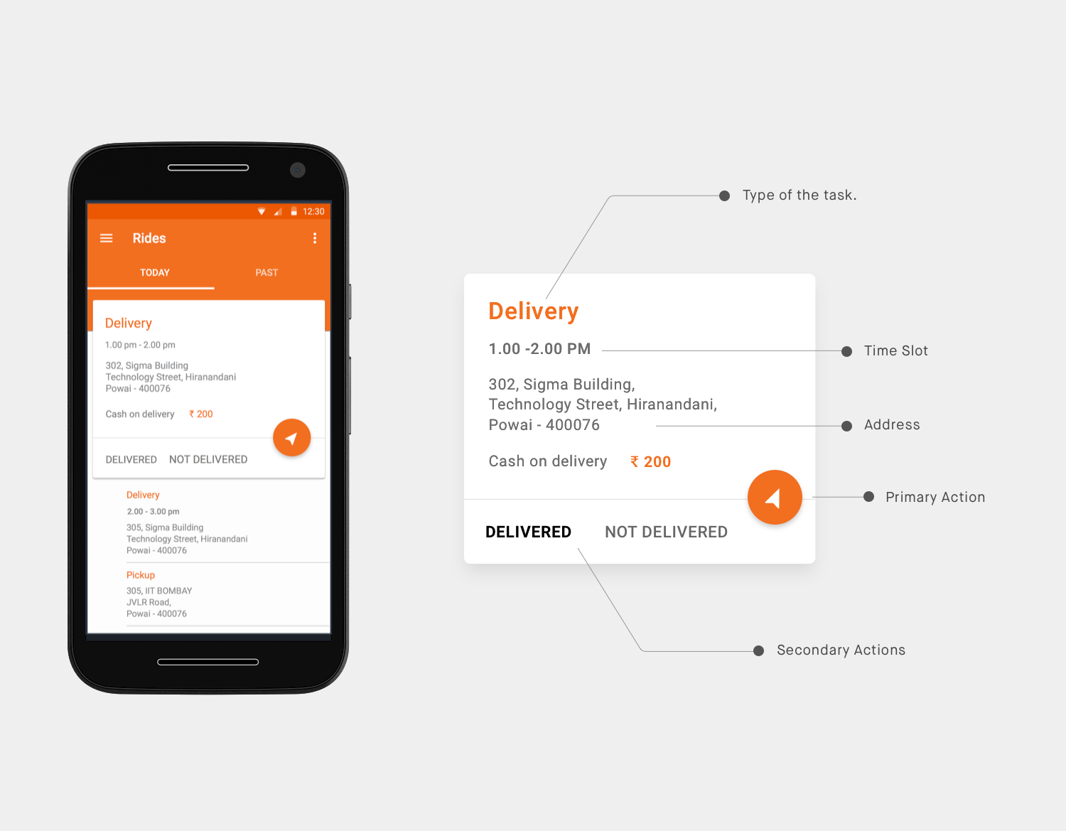
A single task to focus on
A primary card interactive card was designed to keep the executive focused on a single task. The upcoming tasks were also listed but were not interactive. The card consisted of all the necessary information required for a task. Also, the primary action was a FAB that enables the navigation to the location. As soon as the task is marked completed or incomplete(only if the user is not available), the task is moved to the past and the next task comes up as the primary card. Tapping on the card also takes him to the detailed page of a task.
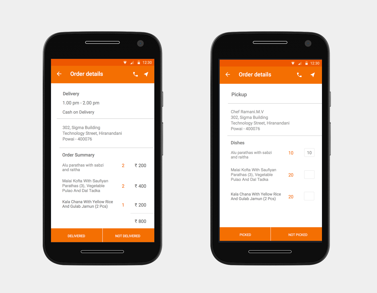
Doubling as pickup and a delivery person
The executive's task was not just deliveries but also few pickups from the chefs too and also deliver the necessary containers needed for them. The details page gives the ability to call the person and also gives details on the items of the task.
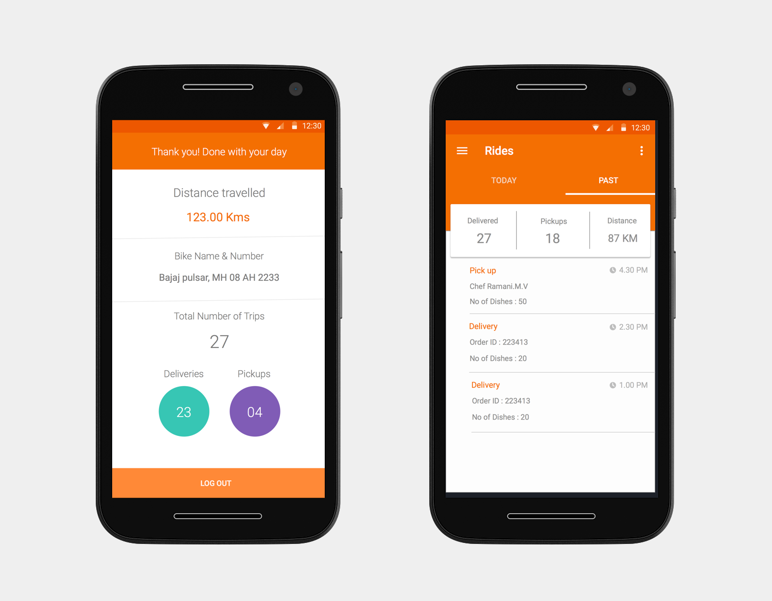
Making the executives feel accomplished
After each closing day or when the executive manually closes his day, he gets the data on how many trips he has done, the total distance travelled, the pickups & deliveries. This gives them a sense of accomplishment and reward which motivates them to do better. This data are also made use to credit their salary on daily basis.
Reflection
Designing an end to end experience with all the necessary applications was a huge challenge in a timebound project. Designing for multiple platforms and multiple form factors at once made me a fast paced person. Got to learn the importance of visual design and visual hierarchy and how it makes the users more engaging. Although we ideated on multiple solutions, all we could build was some minimum viable product within the given time period and resources yet a useful one.